
# 개요
디자인 패턴이 왜 중요할까?
서비스의 규모가 커짐에 따라 사용자 인터페이스인 애플리케이션들도 덩치가 커지고 있다.
따라서 하나의 애플리케이션을 개발하는데, 여러 명의 개발자가 작업을 해야하는 경우가 많다.
일정한 패턴이나 컨벤션이 없이 개발을 진행한다면, 서로 다른 방식의 코드가 작성되어서 누가 퇴사를 하거나, 인원이 바뀐다면 힘든 상황을 맞이할 수 있다.
나는 혼자 개발을 하니 상관없다?
혼자 개발을 하더라도 유지보수를 위해서 디자인 패턴은 꼭 필요하다.
일정한 패턴없이 무분별한 개발이 진행된다면, 흔히 말하는 스파게티 코드나 에일리언 코드와 같은 코드가 작성되어서 유지보수하기 힘든 상황이 발생할 수 있다. 내가 개발을 했지만, 내가 개발한 것 같지 않은 코드를 맞이할 수 있다. (이런 경험을 해본사람이 저만 있진 않겠죠?🥲)
최악은 어떤 기능을 추가 하려는데, 새로 만드는 것이 더 낫다고 생각될 수도 있다.
서론이 길었는데, 아무튼 디자인 패턴이 그만큼 중요하기 때문에, 플러터를 배우고 사용하는 입장에서 블로그에 정리를 하려고 한다.
# 화면 구역별 관리
샘플 소스코드를 다음과 같이 작성해봤다.
Before
import 'package:flutter/material.dart';

class HomeScreen extends StatefulWidget {
  const HomeScreen({Key? key}) : super(key: key);

  @override
  State<HomeScreen> createState() => _HomeScreenState();
}

class _HomeScreenState extends State<HomeScreen> {
  @override
  Widget build(BuildContext context) {
    return Scaffold(
      backgroundColor: Colors.blue[100],
      body: SafeArea(
        child: Container(
          width: MediaQuery.of(context).size.width,
          child: Column(
            children: [
              const Text(
                '디자인 패턴',
                style: TextStyle(
                  color: Colors.white,
                  fontSize: 60.0,
                ),
              ),
              const SizedBox(height: 20),
              const Text(
                'Design Pattern 1편',
                style: TextStyle(
                  color: Colors.white,
                  fontSize: 30.0,
                ),
              ),
              const SizedBox(height: 10),
              const Text(
                '화면 구역별 정리',
                style: TextStyle(
                  color: Colors.white,
                  fontSize: 20.0,
                ),
              ),
              const SizedBox(height: 10),
              IconButton(
                onPressed: () {},
                icon: const Icon(
                  Icons.account_tree,
                  color: Colors.white,
                ),
              ),
              const SizedBox(height: 10),
              const Text(
                'ICT Story',
                style: TextStyle(
                    color: Colors.white,
                    fontSize: 20.0,
                    fontWeight: FontWeight.w700,
                    ),
              ),
              const SizedBox(height: 70),
              Expanded(child: Image.asset('asset/img/profile.jpg')),
            ],
          ),
        ),
      ),
    );
  }
}
결과는 다음과 같이 나온다.
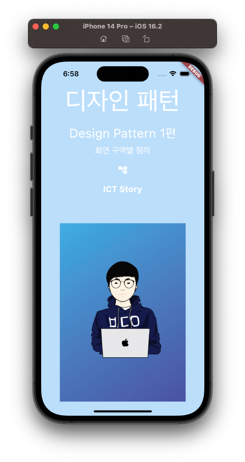
하나의 클래스(_HomeScreenState) 안에 모든 위젯을 넣었다.
사실 요정도 위젯이면, 굳이 나눌 필요는 없겠지만, 그래도 디자인 패턴의 중요성 확인하기 위해 나눠보자.
After
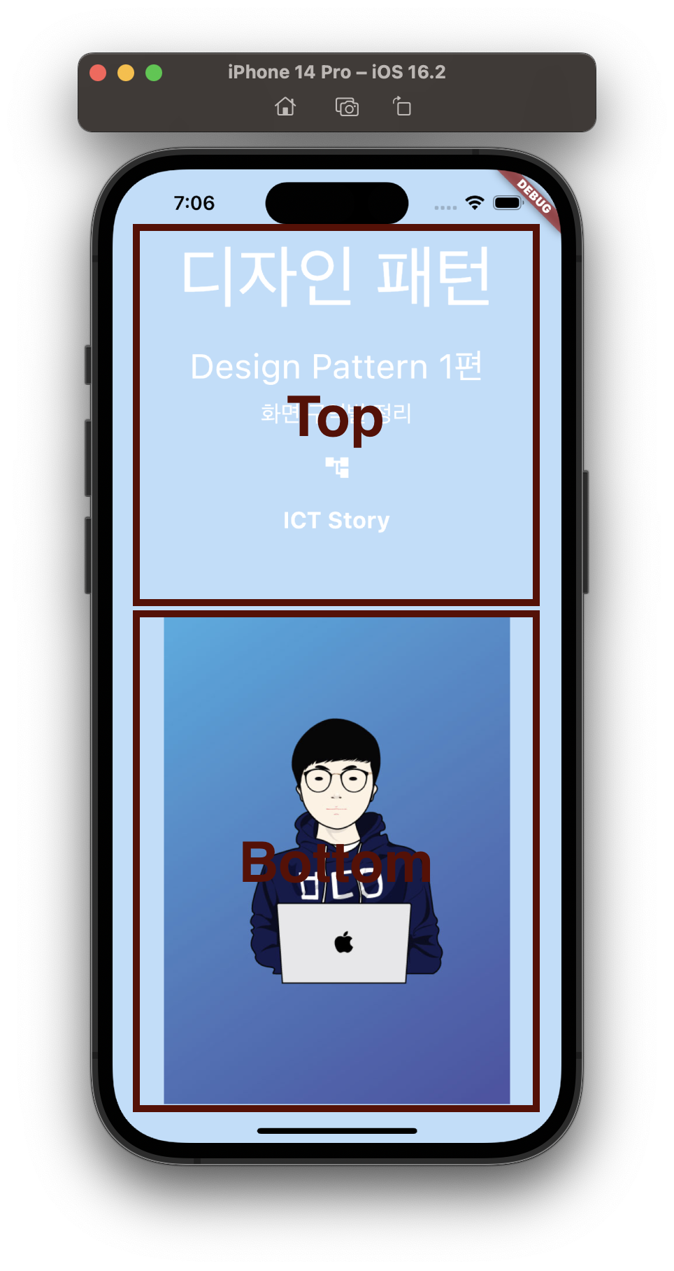
여기서는 Top 영역과 Bottom 영역으로 나눴다.
방법은 간단하다.
각 영역을 StatelessWidget으로 만들어주면 된다.
TopPart
class _TopPart extends StatelessWidget {
  const _TopPart({Key? key}) : super(key: key);

  @override
  Widget build(BuildContext context) {
    return Expanded(
      child: Column(
        mainAxisAlignment: MainAxisAlignment.spaceEvenly,
        children: [
          const Text(
            '디자인 패턴',
            style: TextStyle(
              color: Colors.white,
              fontSize: 60.0,
            ),
          ),
          const Text(
            'Design Pattern 1편',
            style: TextStyle(
              color: Colors.white,
              fontSize: 30.0,
            ),
          ),
          const Text(
            '화면 구역별 정리',
            style: TextStyle(
              color: Colors.white,
              fontSize: 20.0,
            ),
          ),
          IconButton(
            onPressed: () {},
            icon: const Icon(
              Icons.account_tree,
              color: Colors.white,
            ),
          ),
          const Text(
            'ICT Story',
            style: TextStyle(
              color: Colors.white,
              fontSize: 20.0,
              fontWeight: FontWeight.w700,
            ),
          ),
        ],
      ),
    );
  }
}
BottomPart
class _BottomPart extends StatelessWidget {
  const _BottomPart({Key? key}) : super(key: key);

  @override
  Widget build(BuildContext context) {
    return Expanded(child: Image.asset('asset/img/profile.jpg'));
  }
}
_HomeScreenState
그리고 마지막으로 _HomeScreenState에는 children에 _TopPart()와 _BottomPart()를 추가하면 된다.
class _HomeScreenState extends State<HomeScreen> {
  @override
  Widget build(BuildContext context) {
    return Scaffold(
      backgroundColor: Colors.blue[100], // 100~900까지의 값을 설정할 수 있음(연한 정도)
      body: SafeArea(
        child: Container(
          width: MediaQuery.of(context).size.width,
          child: Column(
            children: [
              _TopPart(),
              _BottomPart(),
            ],
          ),
        ),
      ),
    );
  }
}
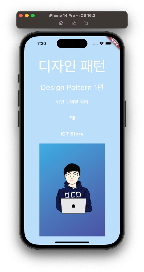
결과는,
전체 소스코드는 다음과 같다.
import 'package:flutter/material.dart';

class HomeScreen extends StatefulWidget {
  const HomeScreen({Key? key}) : super(key: key);

  @override
  State<HomeScreen> createState() => _HomeScreenState();
}

class _HomeScreenState extends State<HomeScreen> {
  @override
  Widget build(BuildContext context) {
    return Scaffold(
      backgroundColor: Colors.blue[100],
      body: SafeArea(
        child: Container(
          width: MediaQuery.of(context).size.width,
          child: Column(
            children: [
              _TopPart(),
              _BottomPart(),
            ],
          ),
        ),
      ),
    );
  }
}

class _TopPart extends StatelessWidget {
  const _TopPart({Key? key}) : super(key: key);

  @override
  Widget build(BuildContext context) {
    return Expanded(
      child: Column(
        mainAxisAlignment: MainAxisAlignment.spaceEvenly,
        children: [
          const Text(
            '디자인 패턴',
            style: TextStyle(
              color: Colors.white,
              fontSize: 60.0,
            ),
          ),
          const Text(
            'Design Pattern 1편',
            style: TextStyle(
              color: Colors.white,
              fontSize: 30.0,
            ),
          ),
          const Text(
            '화면 구역별 정리',
            style: TextStyle(
              color: Colors.white,
              fontSize: 20.0,
            ),
          ),
          IconButton(
            onPressed: () {},
            icon: const Icon(
              Icons.account_tree,
              color: Colors.white,
            ),
          ),
          const Text(
            'ICT Story',
            style: TextStyle(
              color: Colors.white,
              fontSize: 20.0,
              fontWeight: FontWeight.w700,
            ),
          ),
        ],
      ),
    );
  }
}

class _BottomPart extends StatelessWidget {
  const _BottomPart({Key? key}) : super(key: key);

  @override
  Widget build(BuildContext context) {
    return Expanded(child: Image.asset('asset/img/profile.jpg'));
  }
}
이렇게 구간을 나눠서 정리를 해주니, 보기가 한결 수월해진다.
Bottom 영역을 보기 위해서 _BottomPart()를 Command + 우클릭으로 이동해서 보기도 쉬워진다.
상황별로 필요에 따라 중간영역(MiddlePart)를 추가 생성해서 나눠도 좋겠다.